BBB - Head Meta
Each HTML document consist of two basic building blocks: a head and a body. The body contains the actual content while the head consists mainly of meta information. Meta information helps the browser to display the body content in the most appropriate way. Furthermore, it helps other machines to make sense of your page. Machines can be search engine robots or social media platforms like Twitter or Mastodon. When you post a link there, the platform tries to display some preview information like a picture and a short summary. What tags do we need in the head section to make this preview possible?

Have a closer look at the rather small, but functional head section in my HTML documents.
|
|
As you can see, I grouped the head content into 4 parts. Let’s break them down.
Text Encoding
The first group in line 1 and 2 is purely technical and helps your browser to display the text properly.
|
|
I dunno why UTF-8 is not assumed as default, but maybe in other parts of the world another text encoding dominates web pages. Picking the wrong (or no encoding) at all was a popular mistake that transformed non ASCII characters into the replacement character �. This char U+FFFD is used to replace an unknown, unrecognized or unrepresentable character. Since, home grown sites are rather the exception nowadays, the U+FFFD became an endangered species.
I forgot where I picked up the second line (so it was probably from lighthouse to push my score). I think it helps with scaling issues on mobile and/or high res devices.
Visual Appearance
The second group deals with visual stuff, like how the pages looks in a graphical browser. So if you are a hard core minimalist that counts every byte and/or targets terminal browsers (which tend to ignore CSS completely, like w3m), you might want to skip this part completely. For the rest, I highly recommend having some basic styling in one common .css file.
|
|
While modern CSS is often deemed highly confusing - or a total mess - you can ignore most of it in the beginning. The following bullet points should be sufficient to get started and create a decent layout and look:
- build 3x3 layout with CSS grid. Period. Grid is by far the greatest layout system I have seen so far (ping me on Mastodon if you know a better). Use a generator and read Complete Guide to Grid and you are good to go.
- copy styling from other websites that you like. Right click and select
Inspecton an element you like, and the browser will show its CSS properties. - start small and add more when needed. It is okay to look crappy in the beginning. Once you want to support mobile devices like phones and tablets check out media queries. They work great together with CSS grid.
You might have stumbled over articles advocating for inline CSS which is supposed to be ‘faster’ and less likely to break in unexpected ways. Don’t listen to this. Inlining style will have a similar effect like writing each HTML page fully by hand: you become unable to keep it consistent in no time, because it is scattered across all your pages. Just don’t do it. Each decent web server will cache the file and serve it to each visitor only once (and again after you changed it). This is by far the best compromise of speed and maintainability one can ask for.
The two lines after the style sheet link are for favicons, which are the nice, little pictures on browser tabs or bookmarks. There is a whole philosophy concerning favicons and how many you ‘must’ provide. Check this article in case you want to know more. I created just one high resolution version and fed it into one of the many favicon generators you find online. I then picked a larger one for tablet users and one rather small one for all the rest. Just try to find an icon that is somewhat recognizable for sizes between 16x16 and 180x180 pixels.
Sharing Meta
You probably want to share your latest blog post (for instance on social media), and expect the platform to provide some nice preview picture and summary text. This is especially important when you follow the approach of never changing URIs.
|
|
The og: marks the element as part of the Open Graph protocol.
The Open Graph protocol enables any web page to become a rich object in a social graph.
Source: ogp.me
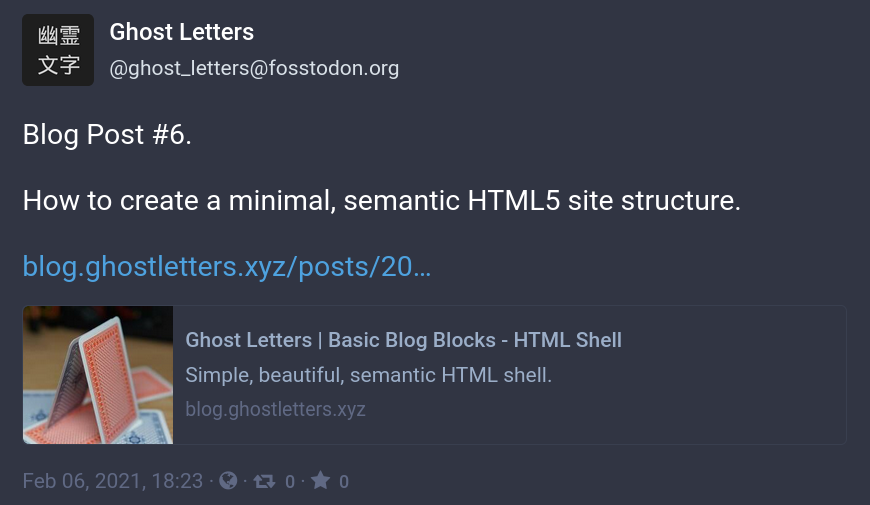
So what do I gain by adding these og tags, you might ask. Have a look at the following screenshots. Which link looks jucier, waiting for a wholesome click? This sad bare bone…

…or this bad boy? Notice the additional description next to the beautiful preview picture.

Again there is a whole lot more behind the these sharing tags. Check out this guide if you want to have the best experience on different platforms like twitter, facebook, etc.
Title
|
|
This one is pretty straight forward. Each valid HTML document requires a title. It is shown on the browser tab, used by search engines and god knows what. Just have it. :)
And that’s it for the HTML head. The body is up next.
See you soon!